This Taurus goddess oil painting wasn’t supposed to be dramatic.
Honestly, I was trying to make something calm. Comforting. Something you’d hang and forget about in the best way. But Taurus doesn’t work like that. The more I softened it, the heavier it felt.
Which sounds backwards.
But that’s Taurus for you.
The idea clicked on a night I wasn’t even sketching. I was cleaning brushes—badly—and staring at an old canvas leaning against the wall. Holiday lights were still up in the studio because I keep forgetting to take them down. Warm, almost cheerful reflections floating against a very dark window.
The contrast felt… stubborn. Like neither side wanted to give in.
That’s when I thought:
Oh. That’s her.
📚 Story Description
How it came together (or: how slowing down made it more dangerous).
I always mess this part up at first. Taurus invites decoration. Texture. Richness. And I leaned into that too hard. Golds everywhere. Floral elements. Too much comfort. It started to look like something you’d see on a wine label.
So I scraped it back. Literally.
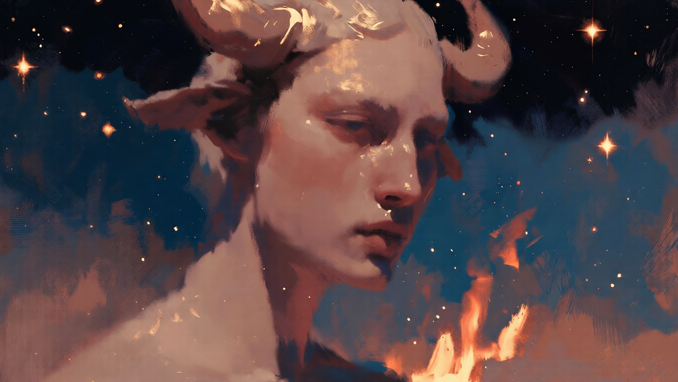
What stayed wasn’t softness—it was weight. The goddess doesn’t move much. She doesn’t need to. Her presence feels grounded, almost immovable, like the room subtly rearranges itself around her.
I left large areas of negative space around the figure. Dark, quiet space. Not empty—just unresolved. It creates this pause, like the moment right before you realize you’ve pushed too far.
The sky became a slow spiral of night blues and muted starlight. Not loud. Not evenly placed. The stars feel heavy, like they’ve been hanging there a long time. Festive tones are buried underneath—warm creams, faint golds, hints of celebration that never fully surface.
At one point I tried making her expression gentler. Softer eyes. Warmer mouth. Deleted it. Too reassuring. Taurus isn’t here to comfort you. She’s here to stay.
That’s where the danger lives.
✨ Some Boring But Useful Notes If You Ever Hang This at Home
This painting changes a lot with lighting. Midday light flattens it a bit. Evening light makes it feel deeper, slower. Almost heavier. I noticed this after wasting two test prints and standing there annoyed, wondering why it suddenly worked at night.
Matte paper is non-negotiable. Gloss breaks the illusion and makes the dark space look cheap. Slightly textured fine art paper keeps the oil layers believable and consistent.
Color-wise, expect restraint. No sharp contrasts. Everything sits close together—earth tones, deep blues, warm neutrals—so your eyes adjust gradually. It’s not a “wow” piece. It’s a stay-with-it piece.
Bedrooms work. Quiet living rooms work. Anywhere people slow down without realizing it.
This piece was built the slow way. Layer over layer. No shortcuts. Even when translating it digitally, the logic stays physical—consistent brush pressure, unified texture, nothing overly polished.
Taurus doesn’t rush. And it doesn’t forgive being rushed either.
Currently writing this while sitting on the studio floor because the chair feels wrong tonight. Also drinking coffee that’s gone cold again. I keep telling myself it’s part of the process.
— PPR, abstract and figurative artist working with mythology, astrology, and emotional tension.
Based in Portland. Still trying to capture the moment before stillness turns into resistance.
If you’ve read this far—
Which zodiac sign do you think holds the most power without ever raising their voice? I’m genuinely curious.
Okay. Enough rambling. I should probably clean these brushes before they ruin themselves. Back to work.

Originally reprinted from: free paper - https://frpaper.top/archives/1984
4 Comments on “Taurus Goddess Oil Painting — Stillness, Weight, and the Quiet Kind of Power That Doesn’t Ask”