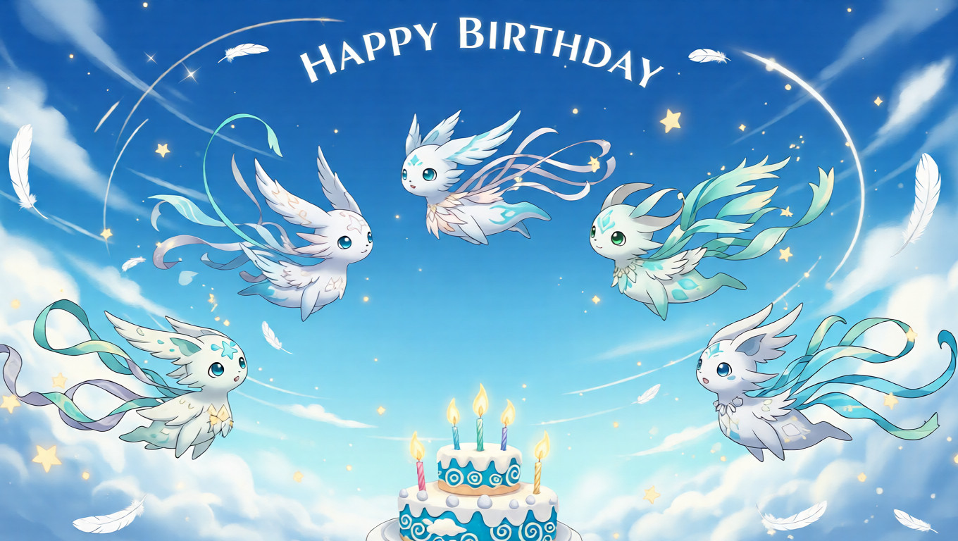
This piece fought me. Repeatedly.
Attempt #1:
I leaned too hard into “cute.”
Big eyes, soft gradients, floating ribbons everywhere.
It looked pleasant. Also completely forgettable.
Deleted after about 3 hours. Complained to a friend on Discord. They politely said, “It’s nice?” which is never a good sign.
Attempt #2:
Went full ethereal. Too much glow. Too many sparkles.
The wind spirit felt less like air and more like a shampoo commercial.
Scrapped it after printing a test and realizing the highlights blew out completely.
Yes, I wasted paper. No, I don’t want to talk about it.
Attempt #3 (the painful one):
I stripped almost everything away.
Less character detail. More negative space.
Let the wind be implied, not illustrated.
This version took longer because deleting things is harder than adding them.
But when it finally clicked, it felt quiet in the right way.
This Wind Spirit isn’t loud.
It drifts.
It watches.
It belongs more to dreams than storms.
Everything here is 100% original—hand-drawn from scratch in Procreate, refined in Photoshop.
No stock assets. No tracing. No shortcuts. Just layers, erasing, regretting, and starting over.
A big influence was “The Book of Yokai” by Michael Dylan Foster (2015)—not visually, but philosophically.
That idea that spirits don’t need spectacle.
Sometimes they just… exist next to you.
Also, honestly, a memory from wandering Tokyo backstreets in early autumn, watching laundry sway overhead like it had opinions.
✨ Some Practical Notes / Design & Print Thoughts
A few things I learned the inefficient way:
- Paper matters more than you think.
I tested this on glossy first. Bad idea.
This piece really comes alive on something textured like Red River Palo Duro Etching.
Yes, I ruined at least two sheets before admitting that. - Lighting:
Soft, warm light works best.
Edison bulbs slightly off to the side—not directly above—keep the negative space breathable. - Placement:
Give it room. This is not a “fill the wall” artwork.
It needs air, literally and visually. - Avoid:
Harsh spotlights, overly colorful frames, or hanging it next to very loud prints.
I tried. It hated that.


Originally reprinted from: free paper - https://frpaper.top/archives/1989
