This Pisces goddess oil painting wasn’t planned.
Which is usually how the ones I trust the most begin.
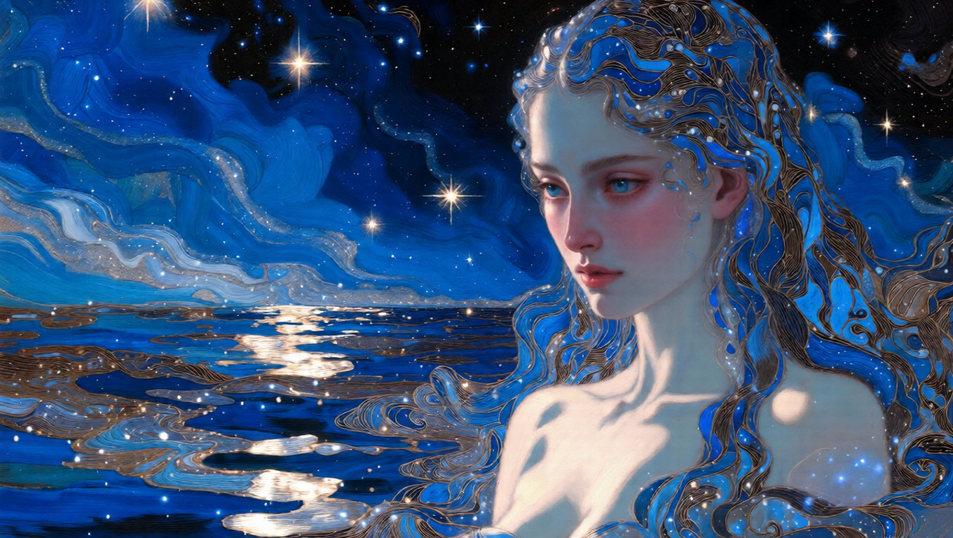
I was supposed to be wrapping things up before the holidays—clearing the studio, archiving old files, pretending I had some sense of order. Instead, I kept circling back to Pisces. Not the cute, gentle stereotype. Something heavier. Emotional. A little dangerous if you lean too close.
Pisces feels like that to me. Soft on the surface, almost generous. But there’s depth there that doesn’t announce itself. You don’t realize how far down it goes until you’ve already stepped in.
I started painting late, well past when I should’ve stopped. Blues first. Deep ones. Then darker layers. Then light—scattered, star-like, almost festive. Not cheerful exactly. More like distant celebration light reflecting off water at night.
The goddess appeared slowly. No dramatic entrance. No pose. Just presence. Calm, elegant, watching. The kind of calm that makes you pause.
By the time I noticed how quiet the studio had gotten, the painting was already telling me what it wanted to be.
📚 Story Description
How it came together (or: why I erased more than I painted).
The first version was a mess. Too much symbolism. Too many visual explanations. Fish motifs, flowing shapes, movement everywhere. It looked fine. Skilled, even. And completely empty.
So I started removing things. Whole sections. Details I’d spent way too long on. I remember hovering over the delete key longer than necessary, which is always a sign I’m about to do the right thing.
What stayed was space. Negative space. Areas that don’t resolve. The goddess doesn’t fill the canvas—she shares it with silence. That silence does more work than any ornament ever could.
I briefly considered pushing the danger further. Sharper contrasts. More obvious threat. Then pulled back. Pisces doesn’t attack. It waits. The tension is emotional, not violent.
The background became a kind of night sky—layered, swirling just enough to feel unstable. Like stars seen through water instead of air. Beautiful. Slightly disorienting.
That’s when it stopped feeling like a zodiac illustration and started feeling like a painting.
✨ Some Boring But Useful Notes If You Ever Hang This at Home
This piece needs room. Visual quiet. Don’t crowd it with loud decor or busy walls. It works best where people slow down—bedrooms, reading corners, places you pass through at night.
The palette is mostly cool, but there’s warmth hiding underneath. Soft, holiday-like light embedded in deep blues and midnight tones. It shifts depending on the time of day. Morning light feels calm. Evening light feels heavier. I noticed this during print tests and decided not to correct it.
Printing was… humbling. Flat glossy paper ruins the surface immediately. The texture matters here. Matte, lightly textured stock brings back the oil-like depth. I ruined a few test prints before admitting that lesson.
Warm lighting helps. Nothing harsh. Let the shadows stay shadows.
Everything here is built slowly, layer by layer, with oil painting logic—even when finalized digitally. No shortcuts, no effects meant to impress. I want these works to live comfortably on a wall, not scream for attention on a screen.
Pisces has always stayed with me because it’s misunderstood. People read softness as weakness. But emotional depth can be overwhelming. Consuming. That tension—between grace and risk—is what I wanted to sit with in this piece.
I’m writing this with the studio heater clicking on and off and a mug of coffee that’s already gone cold. Winter habits.
— PPR, abstract and figurative artist working with mythology, astrology, and emotional atmosphere.
Based in Portland. Still chasing quiet moments that don’t feel entirely safe.
Before I wrap this up—
Which zodiac sign do you think hides the most power behind calm behavior? I’m always curious how other people see it.
Alright. Enough rambling. I should clean my brushes and stop pretending I’m done for the night.

Originally reprinted from: free paper - https://frpaper.top/archives/1973